#promotional graphics
Explore tagged Tumblr posts
Visit Tumblr Blog
Explore Tumblr blogs with no restrictions, modern design and the best experience.
Last Seen Tumblr Blogs


Fun Fact
If you dial 1-866-584-6757, you can leave an audio post for your followers.
Photo
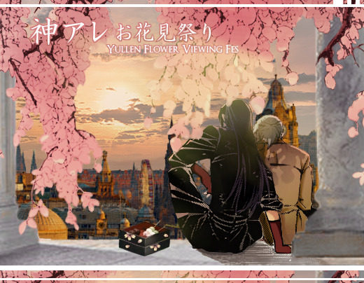
`{/ Yullen/AreKan 🌸 お花見祭り } flower viewing fes.

It’s very short notice, but let’s hold a small hanami for April, as we should be leaving flashback this chapter or the next~
For each week of April, we will feature a flower and its meaning, or you may instead choose one of the word themes for that week to create a piece of artwork, fanfic, edits, cosplay, etc, anything, to celebrate the relationship between Allen Walker and Kanda Yuu from D.Gray-man.
This event is designed for busy adults, so unlike a day for every prompt, this gives you a whole week for one or two submissions per week~ You can submit any day of the week (Sunday is a good day).

(of course, you are free to base your work on your own research of the themes!)

During any day in April, you may also instead choose one of these alternative flowers to create something about, as the free / “bouquet day”:

Please submit entries to the main tag on social media: #Yullen Flower Fes (tumblr) | #Yullen & #YullenFlowerFes (twitter/insta/FB)
(please send it to us in messages if it doesn’t appear in search/tags or is on insta/FB | yes late entries are accepted lmao) (header edited from mamichigo with permission)
{ twitter | discord | ask }
PLEASE BOOST~ even if you can’t participate, THANK YOU! <3
121 notes
·
View notes
Text
Increase the visibility of your brand with AdroitSquare's eye-catching promotional graphics.
With today's extremely competitive marketplace branding visibility, it is crucial for companies looking to create a lasting impression with their target audience. One of the most efficient ways to accomplish this is to use professionally designed promotional graphics that fit your market. If you're trying to promote the launch of a new product, celebration, or simply improving your brand's image with the right images, the right ones will distinguish you from your competitors. AdroitSquare is a complete solution, specializing in designing visually stunning promotional images that benefit companies to make an impression.
The Power of Visual Storytelling
Promotional graphics are much more than simply attractive designs. They are a representation of your brand, relay the message you want to convey, as well as being able to engage your target audience. A well-designed visual attracts attention and builds connections between potential buyers. Colors, forms, typography, and images should align with the brand's values to convey the message energetically. At AdroitSquare, our design process starts with understanding your brand's objectives and identity and ensuring that every graphic tells an engaging story.
Why Promotional Graphics Matter
Increased Engagement
Visual material can generate more attention than text alone. Well-designed graphics can entice your readers to act, whether purchasing on your website, visiting your site for an item, or sharing your material with others.
Brand Recognition
Consistency in design and visuals helps create a memorable brand. By using uniform colors, designs, logos, and other elements, your target audience will be able to notice your company immediately amid a multitude and sea of materials. AdroitSquare guarantees that your advertising images remain consistent with your brand's identity, gaining recognition as time passes.
Effective Communication
Graphics let you convey complicated information in a short amount of time. A well-designed infographic or banner conveys more explicit messages more effectively than lengthy text. This is crucial in today's highly connected digital world, where consumers' attention spans are shorter than ever.
AdroitSquare's Approach to Promotional Graphics
At AdroitSquare, memorable promotional graphics are an art built on creativity, strategy, and cutting-edge design techniques. Their experienced team of branding and design experts collaborates with their clients to ensure that the final product looks nice and produces a payoff.
1. Understanding Your Brand and Audience
Before beginning the design process, AdroitSquare spends time learning about your company's mission, values, and target audience. This ensures that each design is in line with your goals and appeals directly to your intended audience. Whether you're trying to reach a tech-savvy or more traditional audience, AdroitSquare tailors its approach to suit your needs.
2. Custom Designs for Maximum Impact
Each business is distinct, as are its design requirements. Solutions off-the-shelf may not reflect your company's uniqueness. AdroitSquare specializes in designing custom promotional graphics created specifically for your company. Whether it's a banner advertisement, a social media posting, or print materials, each design is created to meet your needs.
Custom-designed designs don't just look more professional and competent, but they additionally benefit your business by distinguishing it from the rest of the market. This warrants that your marketing materials are distinctive and relevant to your industry and catch potential clients' attention.
3. High-Quality Graphics for All Platforms
AdroitSquare recognizes the importance of providing promotional graphics compatible with multiple platforms. From social media to websites to print advertisements, your promotional graphics have to be flexible, adapting to various formats without losing their appeal. AdroitSquare produces graphics optimized for different media and ensures that they look gorgeous whether you view them on a smartphone or desktop or print them.
This multi-platform strategy increases the effectiveness of marketing campaigns while ensuring that the brand is consistent and well-known regardless of where customers encounter it.
4. Timely Delivery and occupational Service
In today's business environment, the importance of timely delivery for marketing campaigns is constantly changing. AdroitSquare is proud to offer competent services that have a short turnaround time. This lets you launch your marketing campaigns according to schedule without compromising the quality of the visuals. When you require last-minute promotional graphics materials to promote an event or long-term branding visuals, AdroitSquare delivers every time.
Types of Promotional Graphics Offered by AdroitSquare
AdroitSquare offers a variety of promotional designs to fulfill the varied requirements of companies across all industries. Here's a look at a few of the most well-known services:
1. Social Media Graphics
In this digital age, visual content is vital for attracting attention. AdroitSquare creates stunning social media graphics that draw interest, boost engagement, and inspire sharing. The graphics are created keeping your intended social media platform in mind, making sure you have the right size, format, and design style for platforms such as Instagram, Facebook, Twitter, and LinkedIn.
2. Website Banners and Ads
A banner for promotion on your website or in digital advertisements should immediately capture users' attention. AdroitSquare creates website banners that are not only visually appealing but also designed to convert. Whether you're running a promotion campaign, launching a brand new product, or promoting an event, their professionally created banners will inspire users to act.
3. Event and Product Launch Graphics
Promotional graphics play a crucial role in creating anticipation in celebrations of special events, such as launch events or product launches. AdroitSquare's designs will help create excitement for your forthcoming events and new products and assure an effective visual presence across all marketing channels.
4. Infographics
Infographics are among the accurate methods of presenting information and data visually. AdroitSquare produces captivating infographics that make complex information more accessible and easy for viewers to comprehend quickly. These infographics are ideal for material for marketing presentations and social media.
5. Email Marketing Graphics
Marketing via email is among the top effective strategies for digital marketing, and properly designed email graphics will significantly improve your marketing campaigns. AdroitSquare produces email headers, promotional banners, and CTAs (calls to action) that enhance the design of your emails and inspire readers to take action on your material.
Why Choose AdroitSquare?
With a myriad of options to you for your promotional materials, what select AdroitSquare? The reason lies in their mix of professionalism, creativity, and a focus on the customer. This is what makes them stand out:
Expert Group: AdroitSquare has a group of highly experienced brand experts and designers skilled in constructing designs that produce payoff.
Custom Solutions: Each project is unique, and AdroitSquare assures you that your advertising graphics are tailored to your requirements.
The commitment to Quality: Quality is never sacrificed at AdroitSquare. Each design is developed with a keen eye for the smallest detail to ensure it meets the most stringent standards.
Customer-Centric Services: AdroitSquare's team collaborates closely with customers and ensures that their vision comes to life using the most efficient method possible.
Conclusion
In the current business environment, compelling visuals are vital to increase the visibility of your business and make your brand more visible to the people you want to reach. AdroitSquare's promotional graphics provide a unique mix of imagination and strategic thinking, ensuring your brand's image is prominent on numerous platforms through working with AdroitSquare to enhance your marketing strategies and ensure that your brand makes an unforgettable impression.
Are you looking to take your company's image to the top? Contact AdroitSquare today to discover how their professional promotional graphics will benefit you and bring off your business objectives.
0 notes
Text
2004
#I did the scariest thing humanly possibly today#I had a job interview#for a big promotion#keep your digital fingers crossed for me friends#2004#old web#webcore#old web graphics#web nostalgia#lgbtq#old web nostalgia#web graphics#queer
344 notes
·
View notes
Text
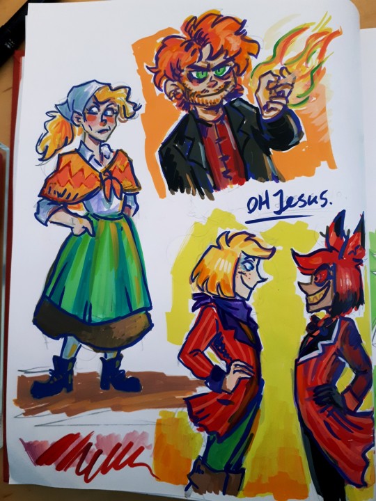
Haha! I tricked you into seeing my original comic characters!😈
(not MY oc's per say, my friend made them im just drawing the comic. They're like my foster children.)
I had to re-remember how to draw these guys cause I've thinking about Hazbin and other stuff instead.
But then got absolutely decked in the head by the realization that Vernilat looks WAY too much like Alastor!😂😂😂
Insane, it's a pure coincidence too!
#grey art#original comic#original characters#hazbin hotel#alastor#graphic novel#man i nedd to get back to it#im on page 105 of 160 im so close to bring done!#😂#shameless promotion
522 notes
·
View notes
Text

476 notes
·
View notes
Note
hiiii I was just popping in to say I just binged all of magicomens and as someone who's a huge fan of both works because i apparently love all the angst all the time, that comic was so adorable and sweet and in character, i loved it so much!!! your art style is amazing and reading that really made my day, i'm so glad that you were able to create and share something like that. i hope you have such a great one and keep creating such amazing stuff (only if you want to, ofc ofc) <3
Eeee thank you so much! Have a great holiday season!
#asks#anon#ps the zine is almost ready!#im setting it up as a kofi product and making a promotional graphic
61 notes
·
View notes
Text

⠀⠀⠀⠀⠀⠀⠀⠀⠀⠀⠀⠀
may⠀ the hunter
request ⠀a promo .ᐣ

V 𝗛e / 𝗛im
I will be posting ;
rentry graphics — dividers — pixel recolors + finds — social media layouts — more hazbin hotel — tcoaal — any other similar medias are not allowed. mutuals are not exempt from this
Excess info ;
i am my own person too. reqs might take a bit. all acs will be in alt text, resource credits are here, here, and here

taglist dm for removal ; @filmstims @lenqkeju @fearmari @infectedrpd @thefallennyxe @prayse @sqwuigly @pokipng @murahaul @muttspec @fiyerooz @fluffettis @doghearted-canine @ubelaces @buni-cheri @baselessbatter @saeriji @vvincian @riflekisses @contemptism @ivaeow @frillylamb @astrogrphx @wiltedpuppeteer @mekubuzii @idol-ism @bydollita @fluffettis
#⌢⌢ ❱ promotion ❱#editblr#rentry#rentry decor#rentry graphics#rentry resources#rentry stuff#rentry inspo#rentry frames#rentry pixels#rentry divider#rentry dividers#rentry frame#rentry icons
58 notes
·
View notes
Text


May the ultimate hope herself request a promo ?

ᛝ⠀— Hello all . You may refer to me as Angelette .
ᛝ⠀— I make all things aesthetic , heheh . I make icons , tumblr layouts , discord layouts , buttons , blinkies , stamps , and everything in between .
ᛝ⠀— I’m relatively new to editing , But I am trying my best . May we learn and hone our skills together .
ᛝ⠀— Requests open . Blacklist / whitelist
ᛝ⠀— Looking for mutuals . I’m very hyper around people I find interesting and wish to be friends with . <3
ᛝ⠀— Thank you dearly for your time .
‘ Not yet , we still can’t see what’s ahead . Hold your breath , for now . ❜


#ᛝ⠀⠀⠀sickbunnyplushie 。 ⠀⠀—#ᛝ⠀⠀⠀promotion 。 ⠀⠀ —#ᛝ⠀⠀⠀important 。 ⠀⠀—#tumblr fyp#rentry#rentry dividers#rentryblr#rentry stuff#rentry decor#rentry graphics#rentry resources#rentry inspo#rentry pixels#rentry gif#rentry template#aesthetic#random pngs#dividers#blog promo#rentry blog#rentry buttons#rentry border#rentry banner#rentry blinkies#rentry backgrounds#danganronpa#izuru kamukura#carrd resources#resourses#fypシ
52 notes
·
View notes
Text

Part 2 response to this ask / [this post]:
For recent books, I think that it's less of a consideration of the audience and more a reflection of the general state of the publishing world currently. Disney as a company (which owns the publishing house through which Rick's works are published) is also in a weird spot right now and that is probably also lending itself heavily to why recent franchise stuff is the way it is:
A.) The franchise is basically guaranteed free money. Disney does this a lot with their properties. Star Wars and Marvel are great examples. They don't need to make something good, they just need to make literally anything and because it's such a massive franchise it'll sell regardless.
B.) One of their main focuses right now is clearly that JKR is in a bad spot and if they can fully dethrone Harry Potter as The de-facto middle grade fantasy series (cause PJO is fully number 2) that's going to be really good for them. Because it basically guarantees that PJO will be even MORE free money. That's probably part of why we got the show when we did, because HP was trying to move forward with an HP show. (And the HP show was probably announced when it was to directly try to compete with PJO) (Also don't forget, Disney also owns the PJO movies now. They don't need to do better than the movies because they're competing with themselves. In fact, by constantly pitting the show against the movies, they're basically doubling advertising for themselves by drawing attention to both.)
B.5.) Another thing is that if they dethrone HP, that's gonna not only hurt Universal, but SEVERELY hurt Universal PARKS, which is the Disney Parks' number one competitor. And the Disney parks are also in a tight spot right now and they REALLY want breathing room. (You might have heard that the Disney parks are doing a TON of cuts and reshuffling right now.) They don't need to actively put PJO stuff in their parks (yet), because just by taking out HP they'd massively injure what is basically the number one draw to the Universal parks (which is probably also why the Universal parks is expanding right now, particularly in similar avenues to how the Disney parks are expanding, re: more fantasy-focused areas and an emphasis on animated/Dreamworks franchises - Universal needs to be able to continue competing with Disney in the absence of HP, and it seems like they're panicking a little bit - so they're leaning more on their Dreamworks properties as Dreamworks becomes a significant competitor to Disney re: animation and otherwise just copying Disney's homework and also making more fantasy-focused park areas right now) and thus Disney would totally kneecap their primary competitor. That would increase draw to their own parks in the absence of a significant competitor and also then if they add literally any PJO stuff to the parks (which would be INCREDIBLY easy just due to the nature of PJO - especially as they cycle out older and less profitable IPs from the parks) then they'd basically IMMEDIATELY get a massive draw from what used to be the HP crowds - because a lot of those casual crowds do not particularly care about HP itself. It's entirely just that HP is the number one mainstream middle grade fantasy series. If PJO takes that spot then they'll just go to wherever PJO stuff is, because they're a passive audience, not an active audience (though Disney is also VERY much known for it's active audience and being partially responsible for making fandom as a concept mainstream and directly advertising to that market - tying back to the first post, lmao).
C.) Disney is DESPERATELY trying to save their streaming service. That's why it's so emphasized that PJO TV is a Disney+ series. Disney is kind of in hot water with investors because streaming services all across the board are tanking and Disney+ is a big one that's going down. That's why they're pivoting so much towards streaming and throwing literally whatever Marvel and Star Wars at it, because they know those are massive franchises that practically support themselves and any kind of draw to the platform is good. PJO is part of that - it's a massive well-established mainstream franchise with a passionate audience. It's practically a default classroom choice for assigned reading and that's free advertising/publicity. They know they can make a mediocre PJO adaptation and throw it on Disney+ and it will have a draw and that's all they need. They just want more eyes on the platform period to try and prove that it's profitable. Not to mention how we just explicitly know the CoTG trilogy only exists as marketing for the show. The recent books are not meant to be a continuation of the story. The actual content within them is literally irrelevant. CoTG trilogy only needs to exist so that it can bring more attention to the show (which is why it's being grouped in with the first series, because search engine optimization). TSATS only needed to exist to get people to stop being mad at Rick/get distracted from his little PR disaster.
Disney has also been doing a lot of cost cutting with their media recently, particularly also relying on their own brand to make new stuff profitable because they're actively looking for cheap solutions instead of making new things. They don't do 2D animation anymore because 2D animation is more expensive because it's unionized. 3D animation has also since become unionized and yknow what they're doing now? Shifting to live action. Shifting to CGI, which is only starting to become unionized because it's newer. They're making one billion live action remakes of existing properties because those properties are profitable and a live action remake is cheap. They don't need to worry about making it good because press is press and they know it will sell regardless. They can cast some popular actors for some default attention and leave it at that (Hi LMM cameo). Even with their newer animated movies - Wish was entirely reliant on the fact that it was heavily drawn from other Disney properties and they used that as an active selling point. Meanwhile they're intentionally tanking other new projects (see: Strange World) because they want to be able to turn around and say projects like that aren't profitable and aren't worth making. (This isn't a conspiracy theory btw, they do intentionally flop certain movies. This is a regular thing Disney does and they've been doing it for a while.) This type of cost-cutting strategy is very clear with the PJO show - they have this absolutely massive budget that isn't reflected in the end project at all. It's extremely clear to anyone with anyone with eyes that they're majorly cutting corners all the time (blatantly avoiding even slightly more complex CGI cause that'd cost money, CGI that is shown is often extremely cheap looking or rushed, reusing assets for Olympus, speeding through certain scenes, very little done with costuming - ever notice how all the costuming in the show looks way too new? The costuming department is supposed to weather even just basic outfits to make them look worn-in and they don't seem to have done that. - poor lighting to obscure details because actually making it look good costs more, etc etc) and the show is poorly produced. They have the money to do it properly. Someone is pocketing that. Usually it's executives. This is not unusual behavior! I would not be surprised at all to hear if it was the case with PJO TV too!
Tl;dr: I don't think the quality of recent books going down is because they expect the books to have a shorter pop culture lifespan, i think it's just a combo of the current publishing industry overall dropping in quality and Disney being Disney and not caring beyond saving their own butts and making a quick buck.
#pjo#riordanverse#pjo tv#pjo tv crit#long post //#ask#anonymous#honestly the way PJO TV is tying into the whole mess Disney as a company is in right now is FASCINATING#also the books thing is again why im wondering what's up surrounding tsats 2#because if TSATS 1 was a PR move to try to distract from Rick's bad press/get him in good favors with the audience again#then what are they doing with TSATS 2? is it marketing? are they trying to divert attention from something?#and what's up with them refusing to promote the graphic novels and then quietly cancelling the BoO one? 🤔
55 notes
·
View notes
Text

[Plain text: May the Cherry Blossom Prince request a promo?]
Hello there! I've recently joined editblr and am looking for some reach!
· · ─ ·𖥸· ─ · ·
I make graphics and dividers, though I'm not experienced enough to make full layouts. My requests are currently open!
· · ─ ·𖥸· ─ · ·
See my pinned post for more info!
Tag list under cut (dm for removal!)
𖡼.𖤣𖥧𖡼.𖤣𖥧
@battampria, @sorroswe, @selysie, @hopefilledgraphics
@bydollita, @batexe, @unknown-till, @lavendergalactic
@sugarcoat-ed, @buni-cheri, @dwollies
And anyone else who'd like to reblog!
#𖹭𓂃 Promotional Post ༝༚༝༚#editblr#edit#graphics#rentry#rentry graphics#rentry resources#rentry decor#icons
38 notes
·
View notes
Text


one-off tenna/mike design idea I had inspired by a couple tenna designs I've seen also, I had the idea that the mech suit is mike, and tenna just took over mike's body like some sort of parasite. tenna's the guy on the screen. idk I thought it was interesting.
#deltarune#deltarune art#deltarune chapter 3#tenna deltarune#utdr#pixel art#pixel graphics#deltarune pixel art#sprite art#mike deltarune#television#deltarune tenna#tv host#what else could I possibly tag this I hate tumblr's excessive need of tags#I wish it was easier to promote posts here... but oh well
37 notes
·
View notes
Text
How to Design Attention-Grabbing Marketing Graphics: The Must-Haves in Tips and Techniques
You cannot but have promotional graphics in any marketing campaign. The design has to capture the viewer's eye, no matter where it is used: social media, websites, or print, to convey whatever message you want saved. In this blog post, you will find some essential tips and techniques that will allow you to develop visually attractive and practical promotional graphics.
1. Know Your Audience
Before commencing work on design, it is prudent to know the audience. Are you targeting young adults, professionals, or families? The design should acknowledge your target demographic's tastes, preferences, and expectations. For instance, a young audience might like bright colours and bolder designs, but others are slightly toned down and classy for an older audience.
Key Points to Consider:
Demographics: age, sex, location, occupation.
Psychographics: Interests, values, lifestyle, and behaviour.
Needs and Preferences: What does your audience desire to see? What are they trying to address?
2. Align with Your Brand Identity
Consistent branding on all platforms and deliverables is essential. In this case, your promotional graphics should represent your brand identity, whether in the colour palette, font, or general design. Why? This enforces your brand in your reader's mind and will also help make the brand credible. Following are some tips for a brand not to lose consistency in its branding:
Colour palette – Use the same colour palette and fonts in all your designs.
Add the logo somewhere in the forefront, but let it not interfere.
Stick to your brand voice and tone. If your brand is fun and playful, make sure that the graphics also do justice to these adjectives.
3. Keep It Simple and Clear
The most frequent mistake in design is overloading the design with information. Some of the best promotional graphics are very simple. They are meant to focus on one singular message or call to action, so don't allow extra clutter to be added to the design.
Designing for simplicity:
Limit text: While informative and catchy, language should be concise. That way, your message will be easily digestible at a glance.
White Space: Do not be afraid of space; it focuses on the main elements of the design.
Iconography: Use icons and visuals that are easily recognizable and relevant to your message.
4. Use High-quality Visuals
Quality should not be compromised in promotional graphics. Pixelated images will only worsen the brand image and kill some of your campaign's effectiveness. Always use high-resolution images and vectors that look sharp and professional on all platforms.
Choosing the Right Visuals:
Stock Photos vs. Custom Images: Although stock photos are effortless to acquire, custom images or illustrations have a greater impact on the brand.
Vectors: Can be resized to any size without losing quality; use for logos and icons.
Image Optimization: Share online images in the correct format and quality to reduce the loading time.
5. Strategic Use of Color
Colour can be used subconsciously to change emotions and behaviour. When used correctly, colour can make your promotional graphics more attractive and effective.
Below are the colo
Brand Colors: Use your brand's colour palette to ensure consistency.
Contrast: Use contrasting colours for important information or calls to action.
Psychology of Color: Different colors evoke different emotions. For instance, blue can be a colour of trust, while red can send an urgent signal.
6. Effective Typography
Typography is not just about choosing fonts; it's the art of arranging text that has in it the feel of beauty and readability. Good typography enhances your design and communicates better with the readers.
Top Typography Tips
Font pairing: Involves setting up and using two to three complementary fonts for your headings and body text. For instance, a bold sans-serif font should work well for the heading and a simple serif font for the text body.
Hierarchy: Use size, weight, and placement to create an order of importance in the text so you can automatically lead the viewer through the information.
Text legibility: The text should be readable in a small place or at less than optimal viewing distance.
7. Create a Visual Hierarchy
Visual hierarchy is arranging elements visually to direct a viewer's eye through a design in a presented order of importance. That way, we ensure the most critical information is first seen, followed by secondary details.
How to Create a Visual Hierarchy:
Size and Scale: Make the most essential elements larger and more prominent.
Colour and Contrast: Use bold colours or contrasts to highlight critical areas.
Placement: Position essential elements in the areas where the eye naturally falls, such as the centre or top of the graphic.
8. Incorporate White Space
White Space, or 'negative space,' refers to the empty areas around your design elements. It is a potent tool, powerful enough to change the outcome of your design experience from one that looks cluttered and overcrowded to one that comes off as acceptable and professional. Appropriately using white space can subtly bring out your design's professional look and feel.
White Space Effects:
Focus: Helps guide the viewer to the most significant parts of your design.
Harmony: Offers a harmonious layout, which feels orderly and transparent to the eye and mind.
Adds Visual Appeal: This makes your design look crisp and contemporary.
9. Use Trends Wisely
Keeping up with current design trends may make your graphics feel new and current. However, you must use trends that will ensure value to your brand and will not look outdated soon.
Current Graphic Design Trends:
Minimalism: Neat and void designs with much space.
Bold typography: typography with large, bold fonts that tell the story.
3D elements: Use 3D features to give your design some dimensions.
10. Test and Optimise
When you have your promotional graphic created, you should test its effectiveness. This might be done by A/B testing for a different version of performance or gathering feedback from colleagues or focus groups.
Testing strategies:
A/B Testing: Create identical versions of your graphic but with slight alterations, and test them out on various subsets of your audience.
Feedback Loops: Regularly collect feedback from the audience and use it to refine your design.
Analytics: Make decisions backed by data with the graphic performance tracking tools.
Conclusion
Combining promotional graphics can be a fresh mixture of creativity, strategic thinking, and technical know-how. By understanding the audience, maintaining the consistency of the brand, and focusing on simplicity and quality, you can make graphics that not only do the job but also deliver the message. To facilitate this, the following tips and techniques will help you whip up compelling promotional materials that provide clinch results—creating not just any graphic but any digital ad, flyer, and product packaging.
0 notes
Text

Shout out to my wife walking past the Black Butler section in the anime store today because they thought professor!Sebastian was a dominatrix.
I can see it.
#I'm in Taiwan for Lunar New Year with my wife's family and I've been desperately searching for black butler things.#because i have an obsession. and because everything is much cheaper here.#and my poor beloved wife had endured at this point 13 different anime stores (not an exageratio#.many big tiddy anime figurines. and one truly graphic tentacle figure that was bigger than my head.#but we finally found my son. and i put my distaste for gambling aside and bought button lootboxes to get hin#i now have a soma. redmond. and a ciel button. i am. delighted.#i wish they had more black butler stuff tbh. but either it's not popular here.#or we just aren't close enough to the new season for promotionals.#black butler#kuroshitsuji#sebastian michaelis#animate Taipei#in case anyone wanted to know the store#yapping
23 notes
·
View notes
Text

Might this humble Knight ask for a Promo?

I am Arlecchino, also known as the Knave. I make rentry graphics, templates, etc. I can be reached through my inbox or through DMs. I am new to this community, so any requests, reblogs, feedback and support are appreciated. Thank you.

Contact me through DMs or Asks to be removed.
@editloids @essthereal @endingun @yourdarlingness @idolbunnies @idolrinko @i43furi @internetoverdosed @phantasverie @puresel @damslietta @angeldollys @aquariium-ediits @seraphmaws @smilingnap @staryyyxo @stringtheo @daintykill @deertism @f-urina @frillu @halloweddoll @gearfr3ak @kyuswi @kumodesu @kiochisato @liardolls @landmineangel @loveneuro @lavendergalactic @countie @chereternal @circuswhisprs @courtofjustice @vashwoodyuri @bwoonies @magnoliawriter @mod-ais-icons @otoripink @thydragoness @strawberrymedicine @missfortunates @dressupidol @vashwoodyuri
83 notes
·
View notes
Text
I would honestly call the left's inability to accomodate people with morality-based OCD compulsions an accessibility issue at this point.
#coming under this: black and white morality thinking!#constant guilting about posting on social media showing your true values and personality!#shitting on people for their alarm about protest suicide! (with bonus 'how dare you insinuite mental illness was a factor!')#glorification of making yourself suffer mentally by viewing uncensored war imagery in 'solidarity' for those suffering in war!#unquestioning acceptance of all of the above as good and right!#promoting the idea that the individual self is expendable and that focusing on yourself (even to survive) is a reflection of your character#seriously this website cares so much about mental health until suddenly it doesn't- fuck the left so much for this i'm so triggered by this#not to be graphic but if i ever take my own life and claim it is for activism- this is not out of the realm of possibility#i DO NOT want anyone to justify my decision with it being activism and indirectly encourage others to do the same#i want people to instead look at the kind of rhetoric that causes people to choose this as a way out!!!!!!!!!!!!!!
103 notes
·
View notes
Text

may the carer of pandas receive a promotion?
hi gang I would like to feed my addiction called identity V so if you guys could commission me that would be lovely! ^_^ I usually do
• graphics
• discord layouts
• bundlrs/rentries (bundlrs preferred but I can do rentry!)
• tumblr layouts
examples under the cut, along with the link to my commissions that has prices + more examples
graphics


———
bundlrs


name hoard graphic by @/timedusts and prn hoard graphic by @/arozuya (I’m aware their supposed to be tumblr banners.. sighs..) also I have beef with cat box for being down while making this.
———
discord profiles


COMMISSION LINK
DM TO BE REMOVED: @williamkisser @lavendergalactic @promoblr @deertism @preyr @pinkidol @angelicomplex @timedusts @arozuya @theleverethiding @lenqkeju @adoretism @creepysp4ghetti @effectivedrone @zombiebomb @rwuffles
extra notes
opening my inbox a bit more but ONLY for things in my whitelist 🙏🏽 also sorry for all of the pings.. I need money..
#⭔﹒promotions#🐼﹒ conversations#commisions open#rentry graphics#discord profile#rentry#bundlrs#tumblr layouts#plz I’m desperate#identity v#sanrio x idv#pokemon#bungo stray dogs#ghost bc#honkai star rail#matching graphics#kangel#needy streamer overload#project sekai#reverse 1999#danganronpa#little nightmares#puppet combo#dinosaur king#shadow house#yandere simulator#my little pony#across the spiderverse
29 notes
·
View notes